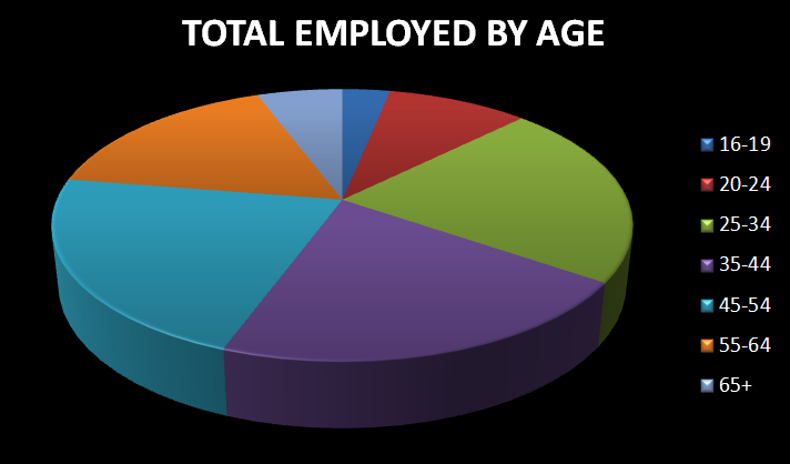
This chart shows the different age groups and how much of the work force they made up in the year 2015
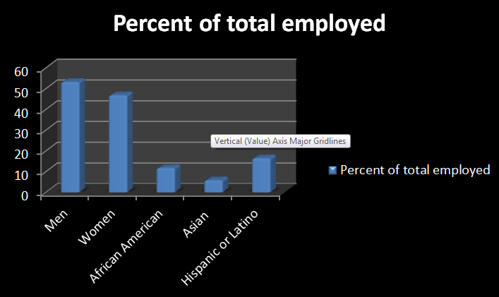
This chart shows how each survey group ranks as a percent of total employed in the year 2015
You can clearly see that the number of men in the workforce continue to out-number the number of women in the workforce, although the gap does appear to be getting smaller and smaller. A larger percent of the workforce also appears to be middle-aged people from ages 35-44, however the workforce seems to be pretty diverse in regards to age. As you look at the percentage of each race employed in comparison to the entire workforce, they still seem to be quite low. Organizations should be promoting diversity whenever and wherever possible as it will only come as a benefit to them in the long run.
To see more statistics, visit the US Labor Board website at : http://www.bls.gov
United States Department of Labor. (2016, September 2015). Labor Force Statistics from the Current Population Survey. Retrieved from Bureau of Labor Statistics: http://www.bls.gov/cps/demographics.htm
To see more statistics, visit the US Labor Board website at : http://www.bls.gov
United States Department of Labor. (2016, September 2015). Labor Force Statistics from the Current Population Survey. Retrieved from Bureau of Labor Statistics: http://www.bls.gov/cps/demographics.htm
